Mission Lane App Redesign (Pt 2) - Rebrand and Unification

Project Summary
Background
Mission Lane aims to become an ecosystem of tools and services that enables underserved customers in America to manage their finances. In its beginnings, we started with credit cards, but we planned to expand into additional products in the next year. In order to build the Mission Lane debit product, we acquired Honeydue (a budgeting app for couples) to use as the platform to build upon. We now had two separate apps— one for credit card customers to manage their credit accounts, and the Honeydue app. In a separate effort, we developed new branding guidelines with the help of Born & Bred to consider all the upcoming ecosystem of products and services we were planning on expanding into the next year.
The Problem
This is part 2 of the mobile app redesign project. After completing the initial stage of the credit card mobile app redesign to enable us to add more products and functionality (you can read the case study for part 1 here), we needed to incorporate the new branding guidelines into the mobile app. Also, we needed to add the debit product into the app.
Business Goals
Portfolio growth through enabling current eligible credit card customers to open a debit card
Platform scalability through updating our digital experiences to reflect the new brand
Success Metrics
Debit account opening conversion rate
Maintenance of app store ratings, NPS scores, CSAT scores
Positive qualitative feedback of redesigned experience
Who are we designing for?
Current Mission Lane credit card holders
My Role
Design lead
Team
Product lead, 3 designers
Diverge
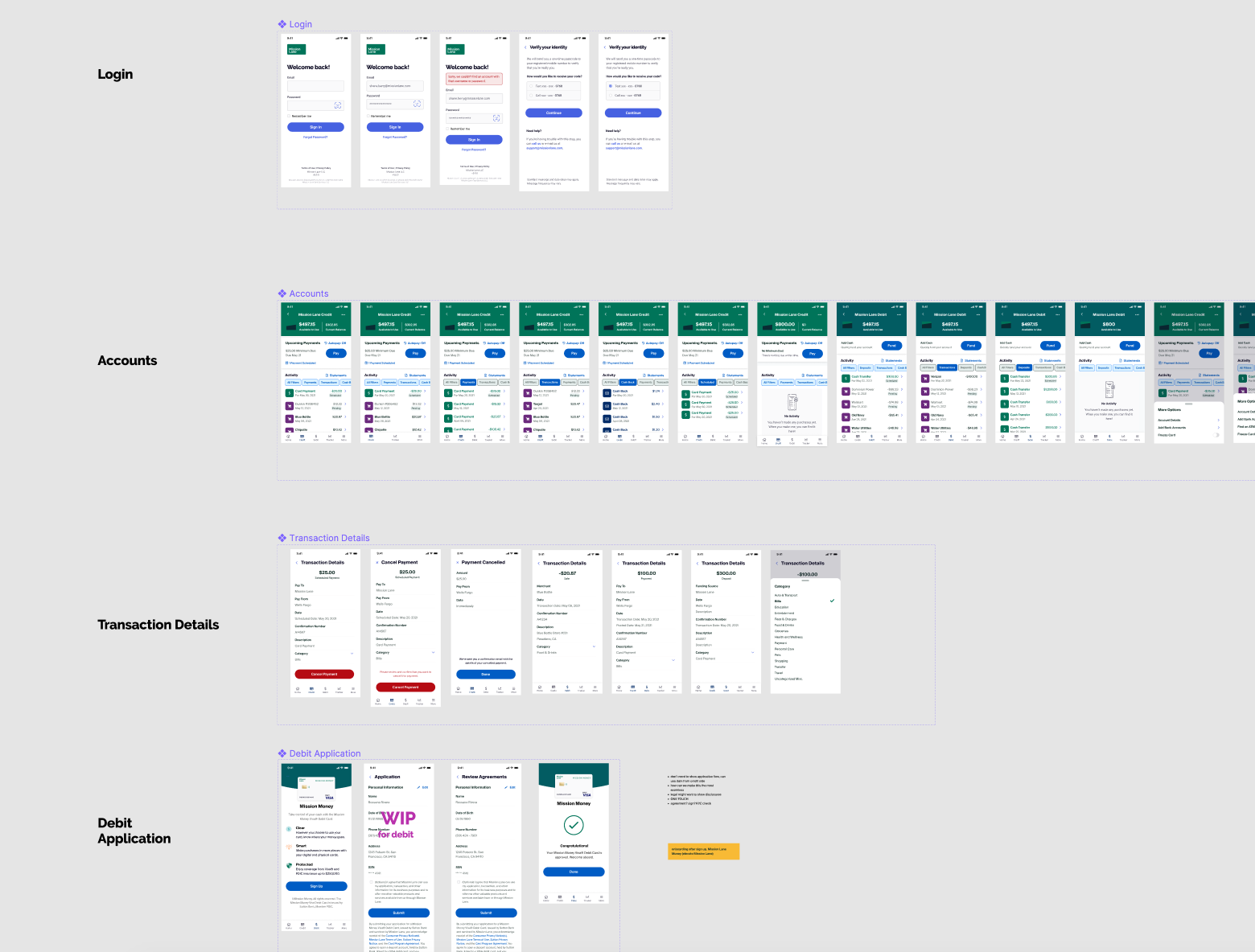
What flows and functionalities are shared between the credit and the debit apps?
In order to understand how to merge the flows between the two apps, we did an audit of all the flows and screens that existed. We then quickly grouped them together to brainstorm how they could be organized.

Exploration of Revised Navigation
Next, we explored a few different ways to revise the navigation structure based on how we grouped the information. Most of them fit into the existing navigation structure that we came up with in the earlier redesign phase (read case study here), but we had to make some changes based on the new content we would be bringing into the app. We also had to think about whether the navigation would look the same to credit-only customers and customers who also have debit (or would it change as soon as they onboarded to debit?).

Exploration of User Flows
We held regular design swarm sessions with the team to build the screens by each user flow. We made each screen into a component so that when we connect them together in sitemaps and wireflows, all instances of the screens will be updated when we make changes.

Converge
Merging User Flows
Once we felt more confident about each user flow through several rounds of iterations and usability testing, we merged the screens into sitemaps and wireflows.

Applying New Brand Guidelines
We worked with Born & Bred to create new brand guidelines that considers the whole ecosystem of upcoming services and tools. This included rethinking our brand positioning, sub-branding, colors, typography, visual elements, illustrations, photography, and content. The design team swarmed in a separate effort to update our team pattern library to incorporate the new brand colors, typography, and visual elements.
