Mission Lane Mobile App Information Architecture
Project Summary
MY ROLE
Design strategic lead, designer, facilitator, researcher
TEAM
Product manager, 5 developers
Background
Mission Lane aims to become an ecosystem of tools and services that enables underserved customers in America to manage their finances. In its beginnings, Mission Lane started with credit cards and each cardholder only had one card. The mobile app then was utilitarian and did its job— it showed customers their balance and transactions, and let them make payments. However, the company planned to scale and expand into new product opportunities, which would mean a user could have multiple accounts and products.
The Problem
The app had limited features and customers rely heavily on servicing agents for resolving many issues rather than being able to get it done in the app. The lack of navigation and information hierarchy made account-related information not always discoverable, and it did not enable the team to continue enhancing the UX and adding features in a thoughtful way. Also, it was receiving terrible average app store reviews due to its lackluster user experience, which affects the company’s standing with investors.

What the original credit card app looked like

Where the app ratings and reviews started from before we made changes to the app
Business Goals
Increase self-service on the mobile app
Improve ratings in the App Store and Play Store
Platform scalability
Success Metrics
Decrease of in-bound calls to agents related to app-related issues
App ratings above a 4.5 in both the App Store and Play Store
Better discoverability of account-related information in the app
Overall decrease of design and tech debt
Who are we designing for?
Current Mission Lane credit card holders
Diverge
How might we align on the fact that we need to prioritize the redesign?
When I started at Mission Lane, I was the second designer in the company and had to partner with multiple teams. Due to my lack of bandwidth, I had to design in a very reactive way and on a per-request basis. All design requests were made in a piecemeal manner and didn’t consider the holistic user experience. It quickly became clear that in order for the company to scale and add new products, it would have to reconsider the entire digital experience and how the information architecture is structured.
I did an audit of the current mobile app, and made a list of opportunities, examples, and their impact on the user experience or our efficiency to add new functionality to the app. I conducted 1:1 interviews with stakeholders to understand their point of view and explained my findings. I then created a proposal and facilitated a cross-functional meeting to present my proposal to all stakeholders (most of whom I’ve met with before 1:1). They were already on board from us syncing separately, so the meeting went smoothly and we spent most of the time figuring out how to prioritize the work rather than debating whether it needed to be prioritized.
What assumptions do stakeholders have about our customers and how they think about their account information?
Once we decided that the redesign would be prioritized, many stakeholders came to me with opinions about how the new navigation should look. Everyone had different assumptions about how our customers think about their credit cards and information.
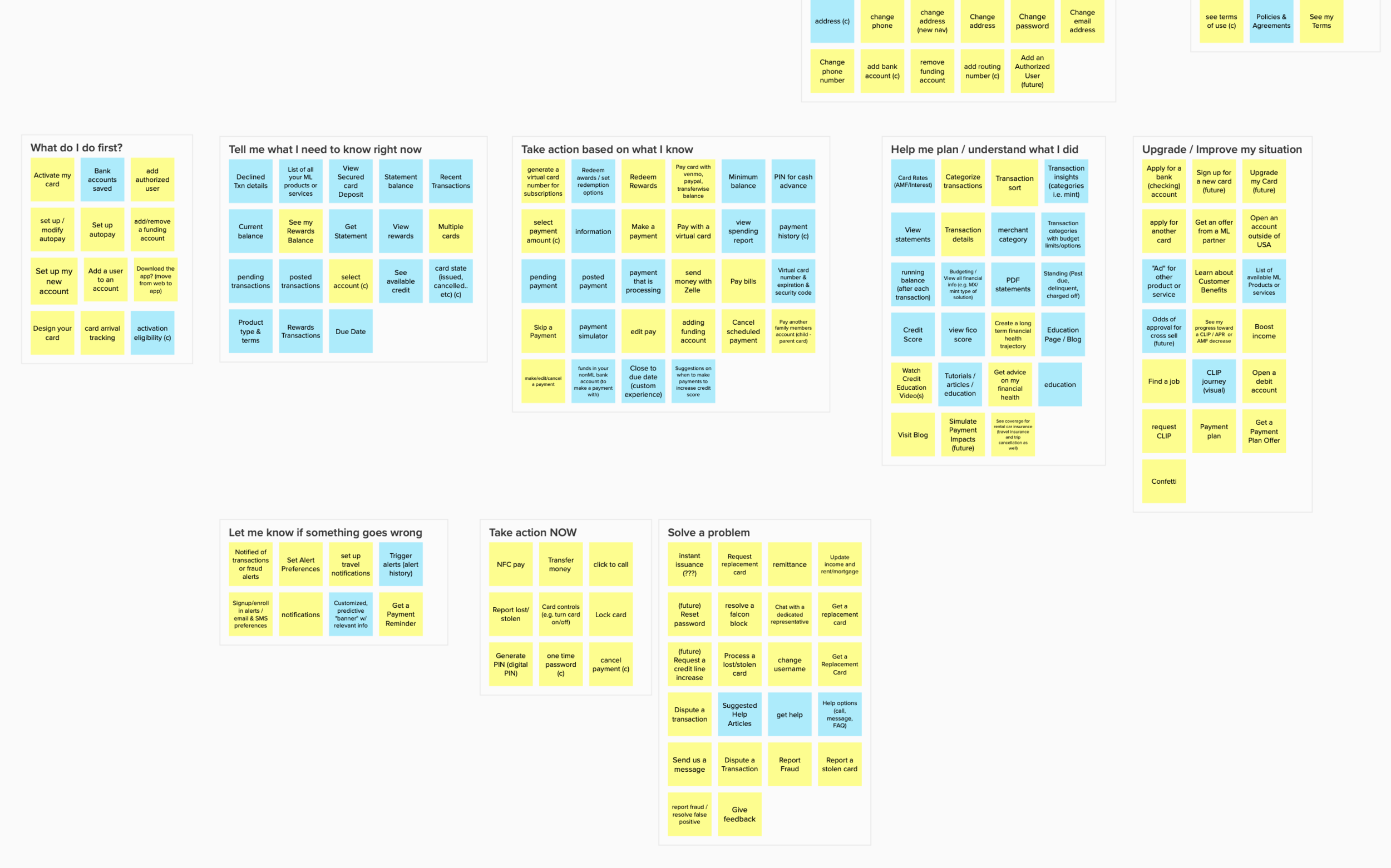
In order to learn how everyone was thinking about this, I facilitated a cross-functional card sort workshop (remote) where we listed out all tasks and information that a customer might encounter on the app. We then individually sorted those cards into categories.

How do our customers think about their account information?
Similarly to the stakeholder card sorts, I ran a couple of card sorts with proxy customers on UserTesting.
My observations from both the stakeholder card sorts and customer card sorts were that at first, people always group together things that are similar to each other in a literal sense, but as they went on, they reorganized them into various buckets of urgency and importance or phrased in questions they want to answer. For example, they always need to know their current balance, so they always categorized “Balance” as urgent. But items such as “Contact for Help” or “Update Profile” were categorized as less urgent, but important, so they expressed a desire to always be able to find these even if they’re not the first things they need to see.
Exploration of New IA and Navigation
Based on these urgency vs importance themes found in the card sorts, I decided to explore a tab navigation based on the most common tasks or questions that a user would have, such as:
What do I need to know right now? (balances, transactions)
How much do I need to pay?
How do I find help?
I also did various explorations of interactivity, the visual hierarchy and layout, especially on the account tab with the balance and transaction information.


Converge
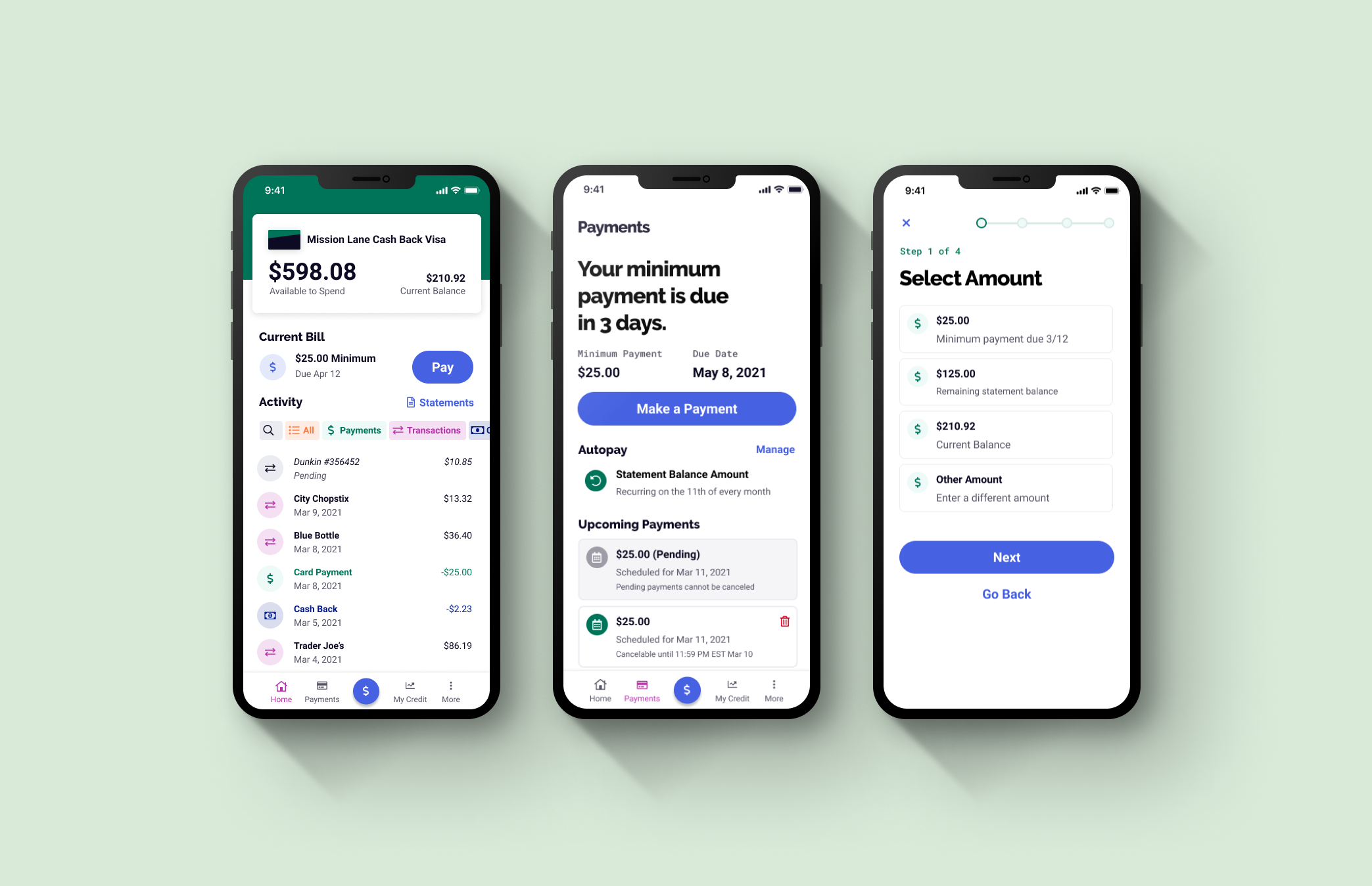
With each iteration, I ran usability tests to see if users would know where to find certain information. After a couple rounds of iteration and testing, I landed on the design below (showing only a selection of screens for brevity).

Deliver
The visual design of this round is not perfect and the brand guidelines would soon be updated, but the hierarchy was much closer to what we wanted and was testing much better than the original app. I worked very closely with the engineers for 3 weeks while they implemented this design and rewrote the app in React Native, and we finally shipped this in May 2021.
The Impact
The redesign and also prompting for more reviews in the app boosted the average rating from a 2.8 to 4.9 out of 5 stars on the App Store and the Play Store.
We eliminated tech debt by rewriting the app in React Native, setting us up for faster releases for more features and another redesign phase in the future.
In-bound call volume increased 10% initially, but went back down by 30% as people started using the app and they were seeing that payments and transactions were easier to find in the app
In some cases, the redesigned experience encouraged more customers to come back and use the Mission Lane card again, as mentioned in one of the app reviews:
“I had previously just put my Mission Lane Visa card away in a drawer since payments and usage was so awful - Now I have the card back in my wallet and am using it regularly. THANK YOU Mission Lane for finally updating your app and all your card services - much appreciated!!”


